Responsive Web Designs that works seamlessly
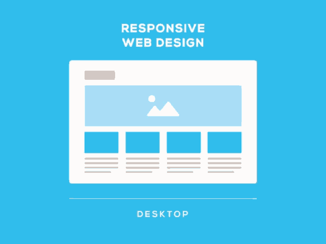
Responsive website design allows a website to adjust its layout and functionality
to fit the device being used, providing a consistent user experience.
Whether on a phone, tablet, or desktop, customers will have access to the same seamless experience, across all devices, when visiting your responsive website.
At PeakyPink Productions LLC, all our websites are designed with social media integration to help forge a strong identity for your business on any platform.